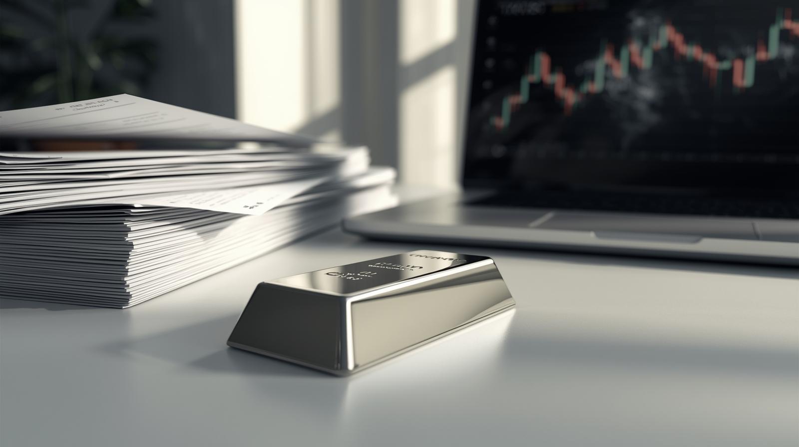
Silver has always been more than a shiny metal. It has served as currency, industrial material, an investment hedge, and even a cultural symbol across centuries. Today, its value moves in response to global events, market psychology, and economic signals that go far beyond mining supply.
To truly understand where silver might head next, one must look beyond headlines and learn how to read its price behavior over time.
Beyond charts and numbers, silver’s journey reflects the rhythm of global change. Shifts in technology, energy consumption, and economic confidence quietly influence how this metal is valued from one era to the next.
What makes silver especially compelling is how quickly sentiment can shift, turning calm markets into moments of opportunity or caution.
This is where a silver price chart becomes a powerful storytelling tool. It doesn’t just show numbers rising and falling; it reflects human emotion, market confidence, fear, optimism, and global change.
The Language of Price Movement
Every market speaks its own language, and silver’s dialect is particularly expressive. Unlike stocks that depend on a company’s performance, silver reacts to a mix of industrial demand, inflation expectations, currency strength, and investor sentiment.
When prices move sharply upward, it often signals uncertainty elsewhere, economic slowdowns, inflation concerns, or geopolitical tension. When prices soften, it can indicate stronger currencies or reduced demand from manufacturers.
What makes silver fascinating is how quickly it can shift tone. A calm, sideways trend may suddenly turn volatile when new data or global news hits the market.
Why Silver Behaves Differently from Gold?
Although often grouped together, silver and gold do not behave the same way. Gold is primarily a store of value. Silver, on the other hand, wears two hats.
On one side, it acts as a safe-haven asset during financial stress. On the other hand, it’s an industrial metal used in electronics, solar panels, medical equipment, and electric vehicles. This dual role means silver responds to both fear and growth.
When industries expand, silver demand rises. When uncertainty spreads, investors also turn to silver. This unique balance makes tracking its movement especially interesting—and sometimes unpredictable.
Reading Patterns That Matter
A price chart isn’t just a line moving up or down. It’s a visual record of decisions made by millions of traders and institutions. Certain patterns repeat because human behavior tends to repeat.
Some common movements include:
- Gradual climbs, showing steady confidence
- Sharp spikes, often driven by news or panic buying
- Pullbacks, where prices cool off before the next move
- Sideways ranges, signaling market indecision
Learning to recognize these patterns helps investors avoid emotional decisions and understand whether momentum is building or fading.
The Role of Global Events
Silver is extremely sensitive to global developments. Interest rate decisions, inflation data, and currency fluctuations all affect price movements.
For example:
- Rising inflation often boosts silver demand as investors seek protection against inflation.
- A strong U.S. dollar can pressure silver prices downward.
- Advances in renewable energy are increasing industrial silver use.
- Political uncertainty often leads to sudden price jumps.
These factors don’t act alone. They interact, overlap, and sometimes contradict one another, making silver one of the most dynamic assets to follow.
Why Traders Rely on Visual Data?
Numbers in isolation rarely tell the full story. A chart brings clarity by showing trends over time rather than isolated values. This visual history allows traders to spot momentum shifts early.
A price chart can reveal:
- Long-term trend direction
- Key support and resistance zones
- Breakout points
- Areas of heavy buying or selling
Even beginners can learn to identify these signals with practice. The goal isn’t to predict the future perfectly, but to make informed decisions based on visible patterns.
Short-Term vs Long-Term Perspectives
One of the biggest mistakes new investors make is confusing short-term fluctuations with long-term direction.
Short-term moves are often driven by speculation, news releases, or technical trading. Long-term trends, however, are shaped by macroeconomic forces such as inflation cycles, energy transitions, and global demand.
A long-range view of a silver price chart often reveals that, despite volatility, silver tends to respect major historical levels. Understanding this helps investors stay calm during sudden dips or rallies.
Emotional Cycles Behind Market Moves
Markets are driven by people, and people are emotional. Fear, greed, excitement, and hesitation all leave fingerprints on price action.
Typically, markets move through emotional phases:
- Optimism – prices rise steadily
- Excitement – rapid gains attract attention
- Euphoria – prices spike sharply
- Anxiety – volatility increases
- Fear – sharp declines occur
- Stability – prices consolidate
Recognizing where silver sits in this cycle can prevent impulsive decisions and help investors act strategically.
Why Silver Appeals to Modern Investors?

Silver’s appeal has grown in recent years for several reasons:
- Increased demand for clean energy technologies
- Greater accessibility through online trading platforms
- Rising interest in alternative assets
- Growing concern about inflation and currency value
Unlike digital assets or stocks, silver has physical value and industrial necessity. This dual identity gives it long-term relevance, even as markets evolve.
Using Charts as a Decision Tool, Not a Prediction Tool
It’s important to remember that charts don’t predict the future; they help interpret probability. No indicator is perfect, and no pattern guarantees success.
Smart investors use charts to:
- Identify trends
- Manage risk
- Time entries and exits
- Avoid emotional trading
When combined with market awareness and patience, chart analysis becomes a powerful ally rather than a guessing game.
Final Thoughts
Silver’s journey is shaped by more than supply and demand. It reflects global confidence, industrial growth, and human psychology simultaneously. Learning to read its movement offers insight not just into the metal itself, but into the world economy.
A well-understood silver price chart becomes more than a tool; it becomes a narrative. One that tells you when markets are calm, when they are fearful, and when opportunity may be forming quietly in the background.
For anyone looking to understand financial markets more deeply, silver offers one of the most revealing stories of all.